
A medal reads as expensive or as cheap before anyone reads the words on it, and the difference is almost always a proportion problem rather than a quality problem. The same artwork that looks considered at 80 mm looks cramped at 50 mm. A slogan set at the right weight looks thin when it has to share a face with a full logo. Relief depth that suits a sculpted souvenir turns a flat medal into a lumpy one. These are not opinions; they are geometric constraints, and they can be specified before a single mould is cut. This guide sets out the design rules that decide whether a metal medal looks premium, with the sizes, thicknesses and line widths that make them checkable rather than debatable.
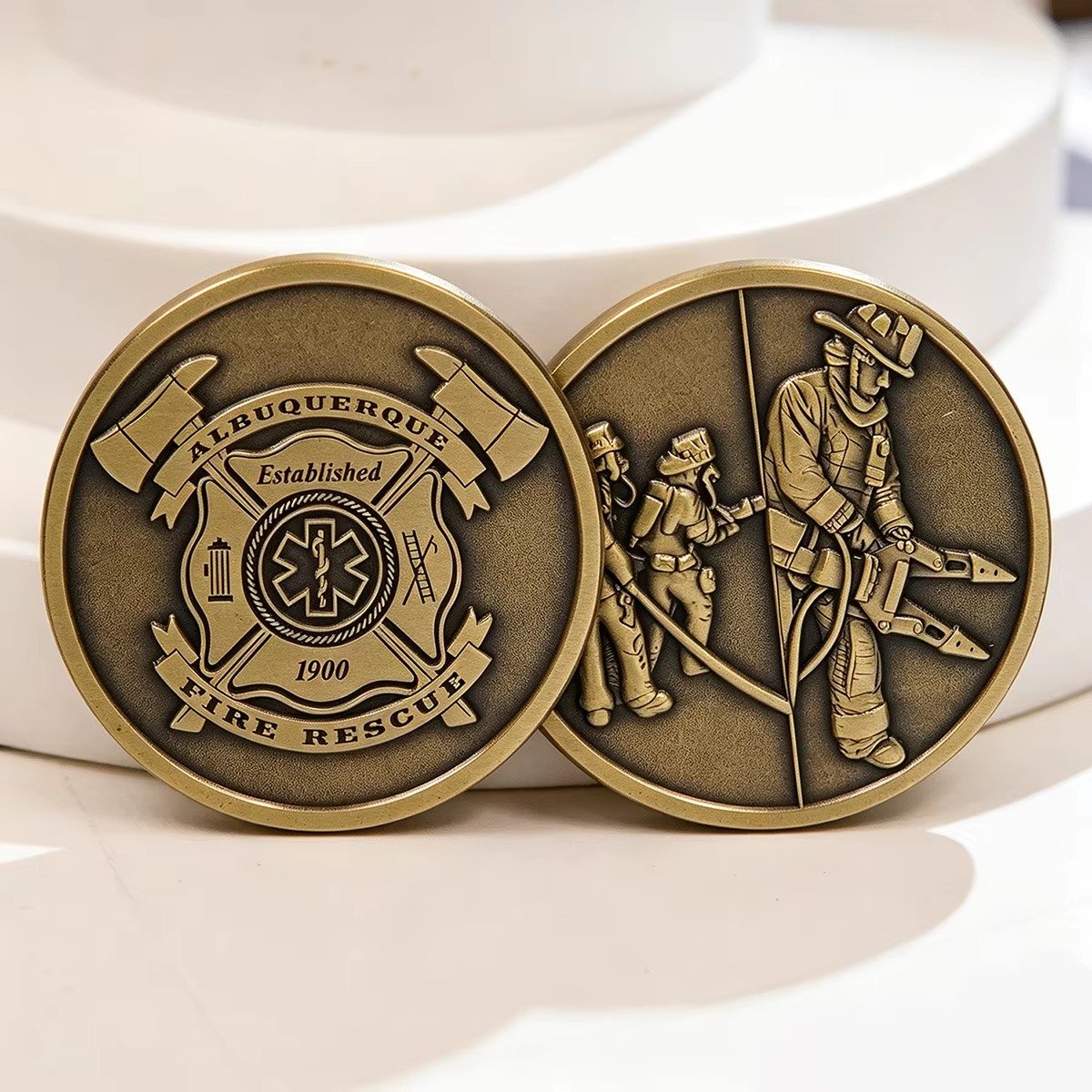
Ordering a custom medal is a six-step process, and that process is covered in our guide to how to order custom medals and challenge coins, from relief level through material, finish, size, edge treatment and packaging. This article covers a different question, one that comes earlier in practice: what makes the artwork work. A buyer can pick every option in that six-step list correctly and still produce a medal that looks mass-produced, because the specification was assembled without ever asking whether the design itself was right for the format.
The rules that follow are arranged the way a designer works: first the face and its proportions, then the relief, then the text, then the colour, then the edges. Each section gives the constraint, the reason behind it and the specific failure it prevents.
Rule 1: set the diameter before you draw anything
Medal size is quoted by diameter, and it is the single parameter that constrains every other decision. It is worth understanding how wide the choice really is before committing, because buyers often believe a standard exists when it does not. The background to the whole category is set out in the reference on medals as a form of award and decoration, which is useful context when a buyer is describing the object to a designer or to a participant.
For everyday event use, the widely used range runs between 1.5 inches (38 mm) and 3 inches (76 mm) in diameter. Within that range, most common orderings cluster at 60 mm, 70 mm and 80 mm. The guidance published by a manufacturer supplying sports medals suggests 60 to 65 mm for 5K and 10K community runs, 70 to 80 mm for half and full marathons, 50 to 60 mm for school sports days, 60 to 70 mm for corporate recognition, 70 to 80 mm for second and third place with 80 to 100 mm for first place, and 80 to 100 mm or larger for commemorative and collector editions designed to be displayed rather than worn.
Two of those recommendations deserve emphasis because they contradict common assumptions. The first is that smaller is not safer: a youth event medal should be evaluated on overall weight, edge smoothness and the age group, not assumed light enough. The second is that the first-place medal does not have to be a different design, only a different size or a different plating colour, and separating a podium set by colour rather than by artwork keeps the tooling count at one.
At the top end the scale extends further than most buyers expect. Medals have been made at 1 inch (25 mm) for youth fishing derbies and at 6 inches (152 mm) for a local show’s top prize. Elite international competition sets its own reference points, with the Paris 2024 gold medal at 85 mm in diameter and 7 mm thick and the Tokyo 2020 gold at 85 mm and 7.7 mm. The International Olympic Committee’s medal specifications set a minimum of 60 mm diameter for Olympic medals with no stated maximum, and place the emphasis on composition rather than size, requiring gold medals to be at least 92.5% silver with 6 grams of gold plating. These are reference points rather than targets, and the useful thing to take from them is that diameter and thickness are separate specifications that a buyer sets independently.
Thin medals are where the budget goes wrong. Published thickness guidance recommends 2 mm to 3 mm as a starting range, with 3 mm being the most frequently used thickness in medal production and a 70 mm by 3 mm combination serving as the common initial reference for road-race projects. The full comparison is in this medal thickness guide, which also notes that a 4 mm medal is not automatically a better award than a 3 mm medal of stronger design quality, and that for two flat pieces of identical outline, material and structure, metal volume is proportional to thickness, so a 4 mm flat disc uses about one third more metal than the same 3 mm disc. A buyer who thickens a medal without improving its design pays for metal and freight and gets a heavier object, not a better-looking one.
Rule 2: work to a margin, not to the edge
The single most common failure in medal artwork is placing content too close to the rim. The reason is structural rather than aesthetic: the outer edge of a struck medal carries the mechanical load of the striking operation, so the design in that zone is the part most likely to distort, and any fine detail there is the first to fill in or break up.
The practical version of this rule is that the design should occupy a centred, clearly bounded area, with the outer band reserved for either a plain border or nothing at all. Designers working from a printed logo often reproduce it at full width because the logo was designed for a rectangle. A medal face is a circle, and a rectangle scaled to fill a circle puts content into the zone that cannot hold it.
The second rule about the face is to decide how much of it the design occupies before drawing anything. A design that fills 80% of the face reads as busy at any size. A design that occupies 60 to 65% with a clear field around it reads as confident, and the field is what allows the relief to cast a shadow and the plating to show. This is the same principle that applies to the physical object: the difference between 2D, 2.5D and 3D metal products is largely a question of how much volume the design occupies relative to the substrate.
Text and imagery should not compete for the same area. The most common crowded medal has a large logo in the middle and a full event name and date curved around it, both at similar visual weight, so the eye cannot settle anywhere. A stronger arrangement gives the emblem its own zone, gives the text its own zone, and treats the border as a third element rather than leftover space.
Rule 3: choose a relief depth the format can carry
Relief depth is the depth of the modelling on the face. Three levels are used for medals, coins and badges: a flat stamped form where the design is cut into the surface, a raised form where the design stands proud of the surface but stays below full depth, and a fully modelled form where the design stands clear of the rim.
Which of these a medal can carry depends on its thickness, and this is where thickness guidance and relief guidance meet. A production drawing may show a base thickness and a maximum overall thickness at the tallest raised feature, and these are different measurements. The published thickness guidance is explicit that a design with deep-looking 3D relief may need changes to shape, mould geometry or production method, rather than simply adding a millimetre to the whole piece. In other words, asking for deeper relief on a thin medal does not produce deeper relief; it produces a redesign.
That is the constraint that catches people out. Adding relief to a 2 mm medal pushes the total thickness past what the piece can carry, so the factory either thins the field to compensate or asks you to change the shape. Deciding the relief depth first and setting the thickness to match is cheaper than reversing that order.
Two further points on relief follow from how struck and cast medals are made. First, a design that relies on very fine raised lines will lose them: because a hard enamel badge is polished flat several times during finishing, the die lines can spread slightly and give the piece a thicker appearance, which is why that process cannot incorporate small details the way soft enamel can. Second, a deep recess is a trap for colour: enamel fills a recess and the fill level has to sit slightly below the surface for the soft enamel texture, so a narrow deep channel is hard to fill evenly and will read as a thin stripe of a different depth than the surrounding colour.
Rule 4: set text size from the diameter, not from the artwork
Text is where medal design most often fails, and the failure is nearly always the same: the type is drawn at a size that looks right on screen and is unreadable on the actual object.
The governing rule is that a medal is read at a distance, usually at arm’s length, often while it is being handed over. Published size guidance states the consequence directly: small medals at 50 mm have limited face area for text and the wording should be kept minimal, whereas at 70 mm and above, full event names, dates and logos reproduce clearly. A buyer who wants a full date, a venue name and an organisation name on a 50 mm medal will get all three and read none of them.
Three practical rules follow. First, fix the text size as a proportion of the diameter before the artwork is drawn, and treat that as a constraint on the copy rather than on the type. Second, count the characters against the arc available, because the text on a medal follows a circle and the available width narrows at the top and bottom of the face. Third, set the hierarchy deliberately: the largest element on the medal should be the one thing you want a photograph of it to communicate, and everything else steps down from there.
Letter spacing is the other half of legibility, and it is the detail that most often separates a professional-looking medal from a homemade one. Type set to fill an arc without adjusting the spacing looks like a label wrapped around a disc. Slightly looser tracking, and a small increase in the gap between the type and any enclosing line, will do more for the perceived quality of a medal than any change to the logo.
One more text consideration belongs at the design stage rather than the ordering stage: the text must be converted to outlines before it is sent, and the exact spelling of names, dates and organisation titles should be stated separately in a note. That note is checked against the approved sample before mass production, which is the last opportunity to catch a typo, because once the mould is cut the text is permanent.
Rule 5: pick the colour process that suits the design
Two enamel processes dominate this category and they are not interchangeable, because they respond differently to line width, colour count and surface character.
Soft enamel has a textured surface with raised metal lines and recessed colour fill. Hard enamel has a smooth polished surface where the enamel sits flush with the metal. Both use the same die-struck base; the difference is in finishing. In soft enamel, the colour is added to the recessed areas after plating and the piece is baked, and because the recessed areas are not completely filled, the result has a textured or bumpy feel. In hard enamel, the colour is added before plating, each recessed area is filled to the top and baked one colour at a time, and the piece is polished flat after each cycle, which is why it costs more and takes longer. This manufacturing comparison sets out both routes step by step, and this technical note on the two enamel attributes gives the thickness figures: about 1.5 mm by default at a 1.5 inch item size for both processes, with hard enamel pieces about 5% thinner after polishing.
The design consequence is a threshold that is worth knowing before the artwork is finished. Very fine lines under 0.4 mm may need adjustment for hard enamel, because the repeated polishing spreads the die lines. The same base can often be used for either process as long as the shape does not change, which means the enamel decision can be made late, after the design is drawn, without reopening the tooling. But designs with custom dyed plating or glitter can only be done in soft enamel.
The choice follows from the design. Many colours, glitter, specialty effects or a need to hold unit cost down point to soft enamel. A clean corporate or prestige look, maximum durability and a smooth surface point to hard enamel. This enamel comparison notes that the same base can often be used for either process as long as the shape does not change, which means the enamel decision can be made late, after the design is drawn, without reopening the tooling. But designs with custom dyed plating or glitter can only be done in soft enamel. A fuller technical comparison of the two finishes and their manufacturing routes is in our guide to hard enamel versus soft enamel.

Rule 6: finish the edge and the reverse deliberately
The edge and the reverse are where a buyer saves money and where a buyer loses it. Both are visible: the edge is visible whenever the medal is held, and the reverse is visible every time the medal is put down on a table or handed over.
A plain reverse with a manufacturer’s mark, a logo and a serial number reads as deliberate and closes the piece professionally. A reverse left as raw casting reads as an unfinished prototype, and it does so even when the face is excellent. Adding a reverse design does not require a second mould in the way a second face design does; it requires the reverse to be designed to sit within the same relief level as the front.
The edge treatment should be chosen for how the medal is handled rather than for how it looks in a photo. A medal that will be worn around the neck on a ribbon needs an edge that will not cut or abrade against clothing, and a medal that is held, stacked or presented in a box needs an edge that reads well when seen side-on. These are different requirements, and the side profile is part of the design.
Proportion between the two faces is worth deciding early as well. A medal with a shallow reverse and a deep front tips forward in the hand and sits unevenly in a box. Equalising the two sides, or at least matching the rim height, is a small design decision that shows up in every photograph a buyer takes of the finished piece.
The design review checklist
The table below pulls the rules above into a form that can be used as a pre-production check, either by the designer before artwork is submitted or by the buyer before approving a sample. Each row names the decision, the check, and the failure it catches.
| Design element | The check | Failure it prevents |
|---|---|---|
| Diameter | Size set before drawing, matched to how the medal is worn or displayed | Text and detail that cannot be reproduced at the chosen size |
| Base thickness | Thickness set to match the relief depth, not added afterwards | A redesign forced by a thin base carrying deep relief |
| Face occupancy | Design occupies a centred area with a clear margin at the rim | Detail in the rim zone distorting under striking |
| Relief level | Flat, raised or fully modelled, chosen against the thickness | Relief that reads shallow or lumpy on the finished piece |
| Text size and arc | Type size set as a proportion of diameter, character count checked against the arc | An event name that nobody can read at arm’s length |
| Type hierarchy | One element visibly dominant, the rest stepping down | A face where the eye settles nowhere |
| Letter spacing | Tracking adjusted for the circular setting rather than left as drawn | Text that looks wrapped on rather than engraved into the face |
| Enamel process | Soft or hard chosen against line width, colour count and surface goal | Fine lines lost to polishing, or a glitter requirement in the wrong process |
| Line widths | Metals outlines checked against the 0.4 mm hard enamel threshold | Detail that fills in during finishing |
| Reverse | Mark, logo or serial included, designed to match the front relief level | A piece that reads as a prototype from the back |
| Edge | Treatment chosen for handling and for the side profile | An edge that abrades clothing or looks unfinished side-on |
| Text accuracy note | Exact spelling supplied separately, with text converted to outlines | A permanent typo cut into the mould |
Two closing notes on how this connects to the rest of the order. The tooling cost and the minimum order quantity both follow from the decisions above rather than from the artwork alone, so a design that settles its diameter, relief and face count early is also a design that is easier to cost. Our guide to how much custom metal gifts cost sets out how the specification components interact on the unit price, and the tier structure is explained in our article on custom metal gifts MOQ. For the visual side, the current custom medals and badges range shows the formats these rules apply to.
Send your artwork or design concept to sales@kingtopgift.com with the diameter and event type you have in mind, and ask for a physical sample at the shortlisted size before committing to the full production run. The proportion rules above are easy to apply on paper and much easier to confirm against a real piece in the hand.